Tutorial: Why html,body height:100% is required for div height:100% to work

A screen with dead space (below the copyright)

Dead Space

Source Code & Working Demo

When working with the new responsive web, one of the issues is to fill dead space (or white space, or negative space). The image (with the caption) Dead Space is an example of such an issue. A “workable solution” is to extend the <div> to the bottom of the screen. This type of solution works good on mobile phones, small tablets and media devices, like iPod Touch. You can test this on your device with the Working Demo.

Extended div.

Extended Div

The image (with the caption) Extended Div is what the “workable solution” would look like. The trick is simple enough.

Note, this trick is not explicitly described or talked about in any of the blogs I have read – including Chris Coyier and David Walsh. Now, it is possible to miss a blog describing this issues because the search is so generic (css height percentage tricks) .

Even when I found the this “trick”, no one could explain it or knows the process to make it happen. It took me a while to figure this out. The clue came from the CSS Almanac at CSS-tricks.com. The complete reason is below.

The CSS3 Trick

Set the follow attribute

height:100%

for all the following HTML elements.

  • <html>
  • <body>
  • <div>

What the Specs Say

At first glance it is not entirely clear why this would work. But if you read multiple descriptions, then it makes sense.

From W3C CSS/Properties/height:

The percentage is calculated with respect to the height of the generated box’s containing block.

This helps, but it does not make sense.

From MDN: Height:

The percentage is calculated with respect to the height of the generated box’s containing block. If the height of the containing block is not specified explicitly (i.e., it depends on content height), and this element is not absolutely positioned, the value computes to auto. A percentage height on the root element is relative to the initial containing block.

Hmm… This adds details, but it still does not explain the issue.

NOTE: The next description seems to conflict, but that is because it is using convoluted logic. It is listed for completeness only. Read the description (max-height) that follows first.

From CSS Tricks: height:

(…) This means a value based on a percentage is still that of the elements content area. Similarly, if the height of the container is set to a percentage value, a child elements percentage height is still based on the content area of that child element.

From CSS Tricks: max-height:

The percentage is calculated with respect to the height of the containing block. If the height of the containing block is not specified explicitly, the percentage value is treated as none.

Okay. So now we have to draw on logic to have this make sense.  And we have to look closer into the W3C spec.

From W3C Visual Formatting Details: 10.5 Content height: the ‘height’ property we see in the “percentage” “meaning” section, the exact words from MDM, except *now* there are links. After reading the links and following the logic is it my contention that the specification is in error. It should read:

A percentage height on the initial containing block is relative to the root element.

If you read the sentence this way, it makes sense.

Conclusion

To be clear on height:100%,

if you do not have body {height:100%} and html {height:100%}, then div {height:100%} has no effect.

The likely reason for this was that the w3c committee want to add this feature without breaking existing features. One side effect is that this feature could be communicated easily verbally and in code, but it could not be communicated effectively in writing because of transcription error when add to the official specifications.

Tutorial: HTML5 – the basics on stacking elements with position: and z-index:

stacking-order

Source Code & Working Example

If you’ve ever tried to make a popup window, like toast(), or a dialog, like alert(),  and you’ve been frustrated by the process, this tutorial should help. NOTE: This code will work in your webbrowser and a mobile device; adding config.xml will allow it to build with Phonegap Build.

When trying to do a popup window, there are three important things to know:

  • positioning
  • stacking (or z-index)
  • hiding the popup

In this article I cover, stacking – or when and how to use z-index. Reminder, “stacking” allows HTML elements to overlap each other. Hence, using stacking allows overlapping to take place. This tutorial will use the “Working Example” linked at the top of the article.

Previously, I covered positioning in another article Tutorial – Text Overlay on to an Image with CSS.

Hiding the popup will be covered in a future article. I will add that link here, when it is done.

Important Note on Using z-index

z-index will only work on an element whose position property has been explicitly set to absolute, fixed, or relative.

Setting Up the Popup

start

START

If you look in app.css, you will see:

#stack1 {left:50px;top:50px;}
#stack2 {left:70px;top:70px;}
#stack3 {left:90px;top:90px;}

From this code, it appears that the stack1 should start before stack2 and stack3, but with the image with the caption START, this does not appear to be the case.

A closer look at index.html shows:

stack-code

A bug in wordpress requires me make this an image.

In this case, simple moving the <div> with id=stack1 above id=stack2 will solve the issue. However for this example we are going to use the z-index to place the element how we want it.

Simple Examples with z-index

doit

DOIT

However, when we do it the results are not what we expect. If we click the button labelled doit, the code below gets executed and the results are shown in the image DOIT. It is not quite what we expect. The order is correct, but for some reason the red element is transparent. (more on this later)


document.getElementById('stack1').style.zIndex = -1;
doit2

DOIT2

The alternative to this is to move the other two (2) elements so they are above the red element. If we then recycle the page and click the button labelled doit2, then we see the effect we have been desiring (DOIT2). The code below shows the method.


document.getElementById('stack2').style.zIndex = 2;
document.getElementById('stack3').style.zIndex = 3;

It is also worth noting that we could have set the z-index of both elements to the value of two (2) and gotten the same result.

Closing Comments

This very simple example was to show four (4) things that should now be obvious

  1. Overlapping HTML elements is available with the natural stacking order.
  2. When the natural stacking order of HTML does not work, use z-index.
  3. Sometimes things do not work as expected.
  4. Sometimes the longer approach works better.

To be clear, when you write HTML – the first element will stack below the second element, and the second element will stack below the third element, and so forth. This is called the “natural stacking order” (or the stacking order based on appearance). So when an element needs to overlap above other elements and it is not in the “natural stacking order”, use z-index. For more details on z-index see below.

Said another way, if you plan the order of your HTML elements correctly, you will not need to use z-index.

Lastly, above I said I would talk about the transparent issue. In the README.md there is a link to an article:

What No One Told You About Z-Index by Philip Walton

In this article, Philip presents the lesson as a challenge to solve a problem. He solves the problem by using opacity. As you read it, you’ll find out why we got a weird outcome earlier, and about “stacking context”. Note: opacity produces a side effect used with stacking.

Video: Top 10 Performance Techniques for PhoneGap Applications

Common Sense and Rocket Science

Common Sense and Rocket Science

In 2013 at Adobe MAX 2013, Christophe Coenraets – Developer・Speaker・Writer, and Developer Evangelist at Salesforce, did a talk entitled Top 10 Performance Techniques for PhoneGap Applications. The talk was video taped and is available on AdobeTV and his weblog.

This blog post is a break down of this video and the ten (10) techniques he spoke of. All ten (10) points are listed below in the order given. The numbers on the right hand side are approximate time marks where Chris discusses the subject.

  1. Don’t generate the UI on the server  ~ 5:00
  2. Don’t wait for the data to display the UI ~10:40
  3. Cache what you can
    1. Cache static data ~ 14:00
    2. Cache some dynamic data, appropriately
    3. Cache element (id) selectors ~ 17:40
    4. Pre-compile templates ~ 20:00
  4. Use CSS transition and hardware acceleration  ~ 23:00
    1. http://github.com/ccoenraets/PageSlider
  5. Avoid the 300ms delay & possibly use fastclick.js ~ 31:00
  6. Load images from one composite image ~ 37:45
  7. Limit shadows and gradients ~ 42:00
  8. Avoid reflow/re-rendering/re-layout/re-drawing the DOM ~ 43:15
  9. Do you need that framework? ~ 50:00
  10. TEST (with real data & real devices & a bad network) ~ 52:00

Summary of talk slide ~ 53:20

Slightly related to this topic is:

Crockford’s Javascript Style Guide from 2007

In this 2007 presentation at Yahoo!, which is meant to be the beginning of a three-course sequence (followed by “Theory of the DOM” and then “Advanced JavaScript”), Douglas Crockford explores not only the language as it is today but also how the language came to be the way it is.

Tutorial: HTML5 Dynamic Font Resize

Source Code & Working Example font-sizes

Every modern webbrowser today has variable font sizes. There are two reasons for this: 1. It was a fairly trivial addition for browser makers. 2. It made the web more accessible to people with disabilities. On the later, it is important to note as the population grows older, vision becomes strained – and therefore adding an option to resize fonts is an important feature.

NOTE: This Working Example works in your webbrowser and on your mobile device; adding config.xml will allow it to build with Phonegap Build.

Today with responsive web, it is a matter of a few lines of code. However, there are a few issues that you will run into.

  • One issue is where to hook the font-size change.
  • The other is margins and padding.

Both of those will be covered after a walk through the example. Note, if you have trouble with the buttons, recycle the webpage.

Initial Size

font-size = 100%

font-size = 100%

The default size set for the <html> element is font-size=100%. In the emulator, the page layout looks very similar to the image with the caption font-size = 100%.

Bigger Size

font-size = 125%

font-size = 125%

If you click the button [bigger], the entire page will have the all the fonts increased in size – to 125% of the original. The emulator results are visible in the image with the caption font-size = 125%. The code to change the font-size looks like this:

document.body.parentNode.style.fontSize = '125%';

Smaller Size

font-size = 75%

font-size = 75%

If you click the button [smaller], the entire page will have the all the fonts decreased in size – to 75% of the original. The emulator results are visible in the image with the caption font-size = 75%. The code to change the font-size looks like this:

 document.body.parentNode.style.fontSize = '75%';

Hooking the font-size Change

If you look at the code in app.js, you will see the modifications to the font-size made three (3) different ways. The code snippet below outlines the different methods. For all intensive purposes, the first two (2) lines are equivalent.

document.getElementById('allOfIt').style.fontSize = '100%';
document.body.parentNode.style.fontSize = '100%';
document.body.style.fontSize = '100%';

The first two (2) references above are for the document element – the one and only <html>. The third reference is for <body>. They will all do the same thing, when you make a change to fontSize.

However, if you change to <body>, you will notice that the [reset] for the first two (2) references (<html>) do nothing at all. This is because the changes are compounding (or inherited, or scoping – depending on your point of view). This means, if make the font bigger for <html>, then that makes the font bigger for <body>. IF THEN, the final font size is 125% bigger for <html> + 125% bigger for <body>. In px this means, we start with 16px, then increase by 125% for <html> – making it 20px, then increase by 125% for <body> – making it 25px!

In the end, <body> seems to be the better choice. However, even after making this decision. There is another hidden pitfall, namely – margins and padding.

margins and padding

When I design my pages I do NOT use px or percent (%); as px is fixed and would require me to hunt down every instance of px and change it — And percent (%) would require similar. I use em, but even this has the infamous css compounding problem (google search link).

So you should be aware that for dynamically font resizing, there are two (2) possible solutions – em and rem.

  • em is equal to the size of the font that applies to the parent of the element. (So, this suffers from compounding.)
  • rem is equal to the size of the font that applies to the root html element, not the parent element.

In general, em works for padding, and rem works for margin. However – excluding headers, I tend to stick to one font. So, you’ll have to make your own judgement – but be diligently consistent!

Sidenote, some designers use 0.625em as a design reference. This Google search will help you research this point.

Bottom Line

Having Dynamic Font Resize is fairly trivial, but requires diligence when design – even for mobile device.

Addendum

Kerri Shotts has suggested also adding a user device preference from phonegap-plugin-mobile-accessibility.

Tutorial: Phonegap Build external webpage in iframe with whitelist example

https://pixabay.com/photo-25490/Source Code & Working Example

In the last few months, the architecture `du jour` has been to create an app that open webpages. This tutorial shows you how to do that for Cordova/Phonegap. The example is written for Phonegap Build, but will work with CLI with minor modification.

The sections below include:

  • Mobile App Caveat – Something every hybrid mobile developer should know.
  • Opening and Closing a URL – Deals with the mechanics of HTML and Javascript.
  • Addressing Security Concerns – How to secure your app when opening a URL.

Mobile App Caveat

Putting aside the security concerns, the most difficult part for mobile developers is that your app may be rejected by the “app stores” – if you do this.

Quote Google Developer Program PoliciesSpam and Placement in the Store

Do not post an app where the primary functionality is to:

  • Drive affiliate traffic to a website or
  • Provide a webview of a website not owned or administered by you (unless you have permission from the website owner/administrator to do so)

Quote Apple iTunes Guidelines – 2.12

Apps that are not very useful, unique, are simply web sites bundled as Apps, or do not provide any lasting entertainment value may be rejected

In addition there is the android-block-pre-4.1.1:

Beginning May 9, 2016, Google Play will block publishing of any new apps or updates that use pre-4.1.1 versions of Apache Cordova.

Google’s Official Alert: How to fix apps with Apache Cordova vulnerabilities

Opening and Closing a URL

This section deals with the mechanics of HTML and Javascript to show an external webpage. In addition, more notes are available in the README.md and the source code.

The code that toggles the iframe uses zepto.js, a light weight jquery clone alternative. The code is listed below; just below is a button. Notice this is not a <submit> element as *was* previously used to create a buttons with HTML forms. This is an HTML5 button and zepto.js working together.

<button id=toggle>toggle</button>

Next, the iframe is wrapped with a <div>. This is where we hide the external webpage (http://cordova.apache.org/blog/). The <div> is initially set to class=hide. This hides the <div> and any children that it has; include the iframe. This class uses the CSS attribue display=none to accomplish this (See: app.css).

code_snippet_001

Below is the mechanics that make the <div> hide and show the external webpage in the iframe. It has one (1) global variable, that can easily be scoped. And as can be seen, if the element isVisible, then removeClass() else addClass(). The variable isVisible keeps track of our state.

var isVisible = 0; // if element initially hidden, zero (0) else one (1)
$('#toggle').on('click', function() {
    console.log("isVisible:" + isVisible );
    if (isVisible) {
        $('#togglePane').addClass('hide');
        isVisible = 0;
    } else {
        $('#togglePane').removeClass('hide');
        isVisible = 1;
    }
});

Next, when testing the working example, you will likely notice a small side effect. The “sided effect” is that the webpage does not load until the hidden <div> is exposed (or has the ‘hide’ class removed). Pre-loading the page is available, but is beyond the scope of this tutorial.

Addressing Security Concerns

At this point in order to appease the “stores”, you will need to use an appropriate whitelist setting. This requires the whitelist plugin and the <allow-navigation> tag with Andoird and <access origin=(...)> for iOS.

The plugin entry in the config.xml should look like this:

 <plugin name="cordova-plugin-whitelist" source="npm" />

The <allow-navigation> tags needed should look like this:

<allow-navigation href="http://cordova.apache.org/" />
<allow-navigation href="https://slack.cordova.io" />
<allow-navigation href="http://www.google-analytics.com/" />
<allow-navigation href="https://*.imgur.com/" />
<allow-navigation href="https://*.twitter.com/" />
<allow-navigation href="https://*.twimg.com/" />
<allow-navigation href="http://cordovablogs.discus.com/" />

What is not immediately apparent is that all the domains listed are required so that the one external webpage will be rendered correctly. Generally, the list of the domains can be extracted by looking at the source, but sometimes you’ll need to open the “information page” for that webpage. On firefox, that is ctrl-i.

Last but not least, is the <access> tag. This is set to the “wild card”, which will allow anything through. To secure the app better, this should mirror the the entry for allow-navigations.

<access origin="*" />

If you have any question, please use the comment section below, or find me on Google Group for Cordova/Phonegap.

For more detailed information on the whitelist and the plugin, read:

Heads-up: Upcoming patch for a high-severity OpenSSL defect

https://mta.openssl.org/pipermail/openssl-announce/2016-January/000058.html

Forthcoming OpenSSL releases
============================

The OpenSSL project team would like to announce the forthcoming
release of OpenSSL versions 1.0.2f, 1.0.1r.

These releases will be made available on 28th January between approx.
1pm and 5pm (UTC). They will fix two security defects, one of “high”
severity affecting 1.0.2 releases, and one “low” severity affecting all
releases.

[…]

Slight Documentation Error causes Background Operations Issue

Baines_1835-Mule_spinning
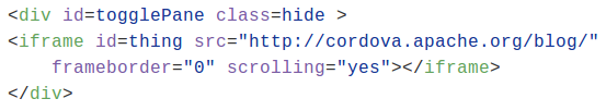
A recent question on a Google group uncovered an error in Apple’s iOS documentation as well as PhoneGap documentation (which also led to unnecessary technical workarounds). The question is How does one keep background opertations running in Phonegap without X Code?

These background opertations include: location, voip, fetch, remote-notification, newsstand-content, external-accessory, bluetooth-central and bluetooth-peripheral.

Here is the Issue

In the Apple documentation in the section entitled iOS Keys then scroll down to UIApplicationExitsOnSuspend; the correct documentation involves replacing ‘run’ with suspend, as shown here:

UIApplicationExitsOnSuspend

Specifies whether the app terminates instead of suspend in the background. See UIApplicationExitsOnSuspend for details.

In the Phonegap documentation (in Events#pause scroll down to iOS Quirks), similarly, the correct Phonegap documentation replaces ‘running’ with exit, as shown here:

For apps to exit when locked under iOS 5, disable the app’s multi-tasking by setting UIApplicationExitsOnSuspend to YES.

This inconsistencies are difficult to spot UNLESS you read other sections, and read carefully. Luckily, the correct setting turns out to be just below UIApplicationExitsOnSuspend It is UIBackgroundModes. In other words, DO NOT use UIApplicationExitsOnSuspend for background operations, use UIBackgroundModes.

How to Run Background Opertations in iOS

UIBackgroundModes
Specifies that the app needs to continue running in the background. See UIBackgroundModes for details.

Following through to Apple’s documentation there are nine (9) services that CAN run in the background.

  1. audio
  2. location
  3. voip
  4. fetch
  5. remote-notification
  6. newsstand-content
  7. external-accessory
  8. bluetooth-central
  9. bluetooth-peripheral

There is more, but I wanted to get this out.

Lastly for the location background service, Apple uses the phrase – “significant change location service”. That phrase is documented in the section ”Getting the User’s Current Location”.

Caveat Emptor – There are two (2) sections with similar titles on that page.

Lastly, I want to thank my friend Oswald Campesato for help me to make this a bit clearer. Any remaining unclarity is mine.

Hybrid HTML5 Boilerplates: Breaking the Chains of Legacy

A roundup of boilerplates for Hybrid Mobile Application Development
This post has two parts: 1. the realization that there is a shift in thinking, and 2. a list of Popular HTML Boilerplates. The analysis and thinking comes from some one working on IoT for mobile devices, not desktop variations of shopping catalogues.

The key point: we do not need to carry the same legacy baggage that web developer and native mobile developers carry. It’s not just that we can develop faster, but also that we don’t have to carry legacy items, like support for IE7 and IE8.


The first part starts with a tale of conscious, but uncoordinated movement within the hybrid HTML5 community1.

A few weeks ago I released an HTML5 boilerplate for Phonegap development. Within days of this, Phonegap did a major release. Days afterwards I decide to step up the release of three (3) boilerplates. Midway through my work, I was taken back a bit when Brian Leroux tweeted the release of his version of a phonegap boilerplate, aka Phonegap-easy-start. So, I quickly finished up and released three (3) Phonegap Generic boilierplates.

brians_pgbpjesses_pgbp

<< brianleroux/phonegap-easy-start

Phonegap–Generic-Boilerplate #1 >>

My next thought was to do a quick blog of other Mobile/Cordova/Phonegap/Hybrid HTML Boilerplates. To my dismay, there were only seven (7) of any worth. Two (2) were from phonegap (start & hello-world), one for Cordova, one for ionic, and one other.2

At some point an epiphany came to me, namely, we do not need to carry the same legacy baggage that web developer and native mobile developers carry. It’s not just that we can develop faster, but also that we don’t have to carry legacy items, like support for IE7 and IE8 — OUCH!.

Phone/Mobile App vs. Mobile Web App
One distinction that is not completely clear to web developers is that stand-alone phone/mobile Apps have different requirements versus Web Apps3. Both are highly concerned with page layout, network access, and compability among mobile devices, but after that it differs. Stand-alone Apps have a variety of additional services that include access to sensors on the mobile device.

The Hybrid view of standard Boilerplates
There are a host of standard HTML5 boilerplates available right now, but only a handful are meant to work with stand-alone hybrid Apps, let alone mobile Apps. Currently, most boilerplates are mainly concern with:

  • page layout and legacy browser compatibility
  • Javascript integration (JQuery, Mootools, etc.)
  • Legacy Maintance
  • Workflow

Advantage of mobile HTML5 Boilerplates

  • Fewer legacy javascript issues, with opportunities to fix +20 year old issues.
  • Fewer legacy layout webbrowser issues, with a new issues added – like screen rotation.4
  • Viewing hardware change more rapidly, so legacy layout issues around screen width are exchanged for other challenges.5

So while, Hybrid HTML5 Boilerplates is definitely in infancy. A clean can and will be made. If you feel inclined to roll your own boilerplage, below the table is a list of Other HTML Boilerplates.


The Other HTML Boilerplate

If you’d like to do your own research for your own boilerplate design, here are some links to get you started.Five (5) searches I conducted

The review of links avoids Javascript Library specific implementations, like Jquery and Angular, and vendor embedded implementations, like Google Tool Kit.

The HTML5 Boilerplate

  • HTML5 Boilerplate is the grand-daddy of them all. It is all encompassing. It should be used a reference, becuase alot of the layout issues do not exist in newer layout engines.
  • HTML5 Reset is a simple set of best practices to get web projects off on the right foot.

Custom HTML5 Boilerplate Creators

  • Initializr – Base on either classic H5BP, Responsive, or Bootstrap
  • html shell – A barebones HTML5 boiler plate with *click* modification

HTML5 Boilerplate Static Responsive

  • Skeleton – A Responsive CSS Boilerplate
  • YAMB v2 – Yet another mobile boilerplate
  • Gridless – An awesome HTML5 & CSS3 boilerplate for mobile first responsive, cross-browser websites

Reviews of Boilerplates

Other Notable Links

PhoneGap Hello World app
https://github.com/phonegap/phonegap-start
https://github.com/phonegap/phonegap-app-hello-world

A boilerplate for HTML5 phonegap applications
https://github.com/ryanbetts/phonegap-boilerplate

Provides a starter project for Ionic apps
https://github.com/cmackay/hybrid-boilerplate

Cordova Boilerplate
https://github.com/iivanoo/cordovaboilerplate

Html5 Native App Part Three
http://mobilehtml5.stungeye.com/2015/06/12/html5-native-app-part-three

  1. Reframing Hybrid | PhoneGap Day EU 2015 (video 35m).
  2. The bottom half of this post has list of standard HTML5 boilerplate alternatives.
  3. Web Apps means Apps that sit in a browser and are not standalone.
  4. Even as I’m writting this, a rotation issue shows up on stackoverflow.
  5. With Android mobile, one issues was exchanged for another, with more than 200 screen sizes available.

An HTML Boilerplate for Phonegap

Phonegap is a framework for creating mobile Apps with HTML5, CSS3, and Javascript. It has the benefit of anything that can work on the web can done in Phonegap with a minimum of effort. In short, you can test on your webbrowser, then port the important parts to a mobile app. In addition, phonegap gives you access to the hardware on the mobile device, be it phone or tablet.

CODE: https://github.com/jessemonroy650/Phonegap–Generic-Boilerplate

The interface is sparse and not intended to handle every situation. The intent is make you familiar with the important parts so that you can get a jump start to building mobile apps.

The Files

  • pg_generic_boilerplateAndroidManifest.xml – not required, but somtimes helpful when building for Android
  • buttons.css – not required, CSS buttons from Alex Wolf and Rob Levin
  • config.xml – required for phonegap, documentation master template
  • favicon-48×48.png – The image in the top left of the App.
  • index.html – required, The view and code in one file.
  • LICENSE & README.md – License for the code & the README for the repository.

The two (2) most important files

  1. index.html
  2. config.xml

index.html

HTML5

If you’ve already developed HTML and are not familiar with HTML5, a good resource, that is mostly correct, is W3Schools. You’ll find things added and things removed. Pay special attention to the elements <div> and <span>, which are considered elements of last resort, but infact are of common use. If the seem confusing, the read about the CSS block model.

The main function

The main function is in the block that starts with if (device.platform === "iOS") It changes the UI (User Interface) to Apple’s iOS iPhone, iPads, and iPodTouch. The internal links point to articles that explain the issue.

The four (4) alerts

The alerts are debugging aids. I recommend you comment them out. More than once, I’ve had to backtrack just to find a typo. The alerts were very assistive.

  1. “button clicked.” – fires when you click the button.
  2. “device ready.” – fires when the Cordova/Phonegap library is ready.
  3. “body loaded.” – fires when the entire webpage is loaded.
  4. “got iOS” – fires only when Phonegap detects an iOS device.

config.xml

This example for config.xml has a minimum of components. I encourage you to learn more from the docs as 1/4 of all questions asked on forums can be answered by reading the docs. I especially encourge you to read the example master template

However there are two (2) very important parts. The first is the App ID. The format of this ID is done by convention. The ID is constructed by taking a domain you own and reversing the order of the subdomains. The last subdomain, by convention, should be the name of the App. NO SPACES ARE ALLOWED

 id = "com.bsdmasterindex.phonegapgeneric-test"

The second important part is the phonegap version that will be used. The “value” is not required, but if you don’t assign it – phonegap will always give you the latest version of the binaries, which may break your App.

 <preference name="phonegap-version" value="3.5.0" />

That’s it. Ask questions in the forums, if you have any.


Ten (10) Phonegap Demo Apps with Source Code

For those unaware, I’ve been busy the last few months helping my parents move from California to Texas. In the meantime, among other things I have created 10+ Phonegap Apps1, each of which uses at least one Phonegap core APIs. In addition all the Apps run in Android and iOS devices – within the restraints of the devices 2.

GPS App

Other goals for these apps:

  • NO JQuery or similar libraries
  • Find the minimum necessary for a phonegap App

These Phonegap Apps are both demos and tutorials. At this point, the apps are operational, but are far from perfect. Over the last few days I have added some changes that give the apps a more professional appearance.

Accelerometer App

Network App

Contacts App

Device App

The Changes

Those changes include:

  • added the plugin device to all Apps
  • added id to the [exit] button and the App header
  • moved CSS style tags from the elements to the head
  • added code to remove the [exit] button from the iOS version
  • removed a CSS coding error
  • removed <span> where unneeded

The following changes still need to be made:

  • Add fastclick.js to remove the 300ms delay
  • Add margin to top of document body to support post-iOS-73
  • Remove all margins from top header
  • Add elements to standardize the header

Future projects scheduled for release are:

  • working boilerplates for rapid development
  • minimual UI libraries for notifications, sliding panels, & div-tables
  • minimual implementation of various phonegap plugins

footnotes

  1. http://codesnippets.altervista.org/examples/phonegap/demos/PUBLIC.Apps.html
  2. Some devices do not have the hardware needed for an API, ie. compass.
  3. After iOS7 a change was made to make system status bar transparent. This cause a program to display over the system status bar.