
If you’ve ever tried to make a popup window, like toast(), or a dialog, like alert(), and you’ve been frustrated by the process, this tutorial should help. NOTE: This code will work in your webbrowser and a mobile device; adding config.xml will allow it to build with Phonegap Build.
When trying to do a popup window, there are three important things to know:
- positioning
- stacking (or z-index)
- hiding the popup
In this article I cover, stacking – or when and how to use z-index. Reminder, “stacking” allows HTML elements to overlap each other. Hence, using stacking allows overlapping to take place. This tutorial will use the “Working Example” linked at the top of the article.
Previously, I covered positioning in another article Tutorial – Text Overlay on to an Image with CSS.
Hiding the popup will be covered in a future article. I will add that link here, when it is done.
Important Note on Using z-index
z-index will only work on an element whose position property has been explicitly set to absolute, fixed, or relative.
Setting Up the Popup

START
If you look in app.css, you will see:
#stack1 {left:50px;top:50px;}
#stack2 {left:70px;top:70px;}
#stack3 {left:90px;top:90px;}
From this code, it appears that the stack1 should start before stack2 and stack3, but with the image with the caption START, this does not appear to be the case.
A closer look at index.html shows:

A bug in wordpress requires me make this an image.
In this case, simple moving the <div> with id=stack1 above id=stack2 will solve the issue. However for this example we are going to use the z-index to place the element how we want it.
Simple Examples with z-index

DOIT
However, when we do it the results are not what we expect. If we click the button labelled doit, the code below gets executed and the results are shown in the image DOIT. It is not quite what we expect. The order is correct, but for some reason the red element is transparent. (more on this later)
document.getElementById('stack1').style.zIndex = -1;

DOIT2
The alternative to this is to move the other two (2) elements so they are above the red element. If we then recycle the page and click the button labelled doit2, then we see the effect we have been desiring (DOIT2). The code below shows the method.
document.getElementById('stack2').style.zIndex = 2;
document.getElementById('stack3').style.zIndex = 3;
It is also worth noting that we could have set the z-index of both elements to the value of two (2) and gotten the same result.
Closing Comments
This very simple example was to show four (4) things that should now be obvious
- Overlapping HTML elements is available with the natural stacking order.
- When the natural stacking order of HTML does not work, use z-index.
- Sometimes things do not work as expected.
- Sometimes the longer approach works better.
To be clear, when you write HTML – the first element will stack below the second element, and the second element will stack below the third element, and so forth. This is called the “natural stacking order” (or the stacking order based on appearance). So when an element needs to overlap above other elements and it is not in the “natural stacking order”, use z-index. For more details on z-index see below.
Said another way, if you plan the order of your HTML elements correctly, you will not need to use z-index.
Lastly, above I said I would talk about the transparent issue. In the README.md there is a link to an article:
What No One Told You About Z-Index by Philip Walton
In this article, Philip presents the lesson as a challenge to solve a problem. He solves the problem by using opacity. As you read it, you’ll find out why we got a weird outcome earlier, and about “stacking context”. Note: opacity produces a side effect used with stacking.


 Source Code
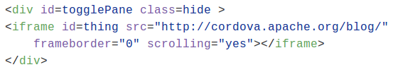
 Javascript Snippets